Work Samples Selected data visualization projects
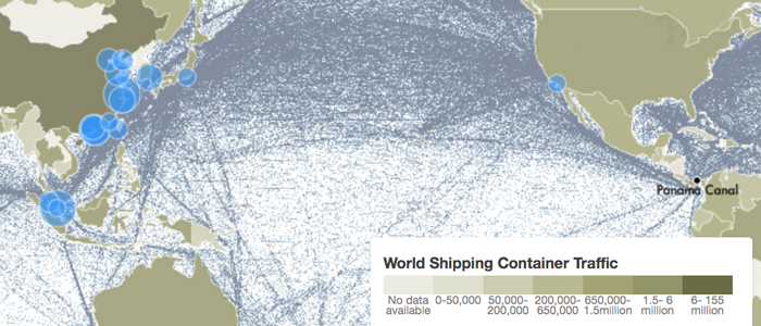
World Shipping Container Traffic
Project exploring the impact of the proposed Nicaragua Canal
Interactive map shows the flow of containers from land to sea and vice versa. Circles show the top 20 ports worldwide, scaled by volume of container traffic. Lines show global shipping voyages for 2007.
Sources: World Bank, World Shipping Council, National Center for Ecological Analysis and Synthesis
View Project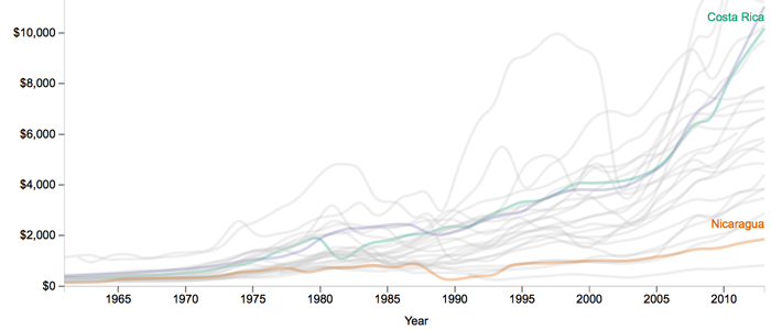
GDP Per Capita in Latin America and Caribbean
Project exploring the impact of the proposed Nicaragua Canal
D3 Line graph comparing how Nicaragua fares against its closest neighbors in economic development over the years.
Source: World Bank
View Project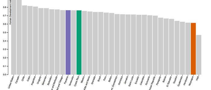
Human Development Index for Western Hemisphere Countries in 2013
Project exploring the impact of the proposed Nicaragua Canal
D3 bar chart comparing the Human Development Index of countries in the Western hemisphere. Nicaragua is the second lowest before Haiti.
Source: United Nations Development Programme
View Project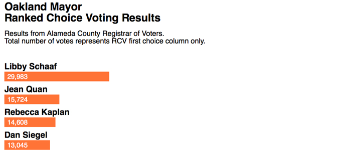
Oakland Mayoral Race Live Election Results
Live election resulst scrapper on Oakland North website
Built a scraper and D3 visualization to pull live mayoral ranked choice voting results to Oakland North on election day.
Source: Alameda County Registrar of Voters
View Project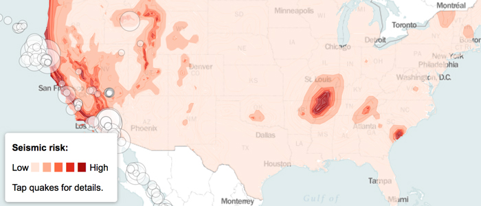
Seismic Hazards in the Continental United States
Class project
Leaflet map showing earthquake risks in the United States.
Source: United States Geological Survey
View Project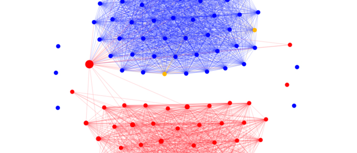
Network graph showing connections within United States Senate
Class project
Network visualization depicting connections within the United States Senate.
Source: Govtrack.us
View Project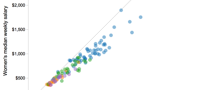
Gender Pay Gap
Class project
D3 Scatterplot showing differences in pay between men and women.
Source: United States Bureau of Labor Statistics
View Project